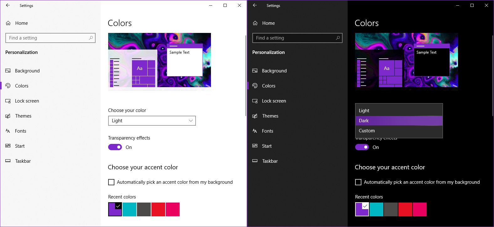
Dark Mode without Javascript
Alternative title: System default theme for webpages
Why Dark Mode
For users visiting a website in a dark room at night, it would be less straining for their eyes if the webpage was displayed in a darker colour to match the environment, which is what dark mode does.

How to do it
From MDN Web Docs:
The @media CSS at-rule can be used to apply part of a style sheet based on the result of one or more media queries. With it, you specify a media query and a block of CSS to apply to the document if and only if the media query matches the device on which the content is being used.
For Non-Static-Site-Generator Websites
There is also a video guide by Eric Murphy on Youtube if you prefer to follow along with a video.
External Style Sheet
To separate code between HTML and CSS, link an external CSS style sheet in the <head> tag in the HTML document. Like so:
<!-- should resemble something like this -->
<!DOCTYPE html>
...
<html>
<head>
    <link rel="stylesheet" href="styles.css">
</head>
<body>
...
</body>
</html>
And in your styles.css:
@media (prefers-color-scheme: dark) {
  body {
    background-color: #111;
    color: #fdfdfd; /* colour of text */
  }
}
With the <style> HTML tag
You can also type out your CSS code in between <style> tags if you prefer everything to be contained in one HTML document:
<!-- something like this -->
<!DOCTYPE html>
...
<html>
<head>
<style>
    @media (prefers-color-scheme: dark) {
        body {
            background-color: #111;
            color: #fdfdfd; /* colour of text */
        }
    }
</style>
</head>
<body>
...
</body>
</html>
For Static Site Generator Websites
It is a little bit less straightforward to do this with static site generators like Jekyll (which is what this website uses) or Hugo, as you have to override the theme’s CSS style sheet.
There is a blog post by Tom Kadwill on how to override your CSS styles in Jekyll you can follow to create your SCSS file, and after which you should get something resembling this:
---
---

@import "minima"; /* replace minima inside the quotes with your Jekyll theme */
And you should get something like this after adding the dark mode code.
---
---

@import "minima"; /* replace minima inside the quotes with your Jekyll theme */

@media (prefers-color-scheme: dark) {
  body {
    background-color: #111;
    color: #fdfdfd; /* colour of text */
  }
}
For other static site generator websites, you can refer to the official documentation found online for information on how to override your theme’s style-sheet.
Configure Giscus Theme
To set giscus comments to match the website if you have done the CSS @media trick shown above, simply set the <script>’s data-theme attribute value to "preferred_color_scheme" as shown below.
<script src="https://giscus.app/client.js"
        ...
        ...
        ...
        data-theme="preferred_color_scheme"
        ...
        crossorigin="anonymous"
        async>
</script>
Conclusion
If you found this blog post useful, leave a comment down below! Also check out how to add giscus comments to your own website on my previous guide for it.